Vienna Secession - In 1897 a group of Artists, such as Otto Wagner and his gifted students, Josef Hoffmann and Josef Olbrich, with Gustav Klimt, Koloman Moser and others aspired to the renaissance of the arts and crafts and to bring more abstract and purer forms to the designs of buildings and furniture, glass and metalwork, following the concept of total work of art and to do so they tried to bring together Symbolists, Naturalists, Modernists, and Stylists.
They gave birth to another form of modernism in the visual arts and they named their own new movement: Secession (Wiener Secession). As the name indicates, this movement represented a protest, of the younger generation against the traditional art of their forebears, a "separation" from the past towards the future. The first chairman was Gustav Klimt.
To pursue their goal they created their own exhibition space: the Secession building just off Vienna's Ringstrasse and the architect would be Josef Maria Olbrich.
But the Vienna Secession promoted their design aesthetic with exhibition posters and its own journal, Ver Sacrum (Sacred Spring). The journal housed reproductions, poetry illustrations, graphic art, decorative borders, object design, and cutting-edge conceptions for layout.
it is start with graphic design which is the magazine VERSACRUM...the illustration...the graphic art. Tomorrow I will bring a kind of example of graphic design in this era related with secession movement......
His obvious frustration with a disorganized sense of style at that time and culture’s dependence upon early traditions presents itself, as he asserted, “those who measure everything by the past impede the cultural development of nations and of humanity itself.” Such strongly worded view against tradition has eventually proven to be the motto of modernist designers, who believed lack of ornamentation was a sign of intelligence.
Graphic design of the ’80s and ’90s can be highlighted by its experimentations with re-appropriation and deconstruction. In that time, designers were determined to not necessarily break from early modernist rules, but instead wished to create a new set of rules which accommodated recent technological and culture advances.
“Not just rule breaking, or a discarding of rules, but an exploration, expansion, and redefinition of the boundaries of design as a dynamic self-organizing system of possibilities, instead of a top-down hierarchy of rules.” - Jeff Keedy
There have been many debates over whether postmodernism was a movement of its own or just a branch of modernism. No matter how it can be categorized, it acted as a shock to a lot of designers at the time and as a result as Keedy put it, “They [postmodern ideas] were called ‘ugly’ and ‘chaos’ and ‘design for designers’ (whatever that means). Today’s renovated Modernism is unlike its original oppositional stance, its existence is only sparked by the fail of appropriation of postmodern ideas, which evidently frightened numerous graphic designers.
PIC: The style was characterised by a bold simplicity, limited use of colour, usually black, white, red- and an emphasis on simple, bold graphic shapes, all of which signaled- according to Rodchenko- the end of painting . In order to discuss the origins of the style and the styles aesthetics, it is important to contextualise the movement with the social and political climate of Russia of the time.
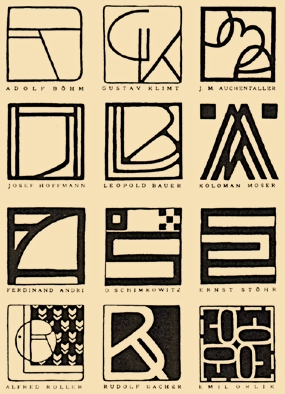 | ||
| Here are some genuine monograms from the Vienna Secessionists, as featured in Meggs’ History of Graphic Design. Modernism in graphic design in the early 1900s can be characterized by the popularity of Bauhaus aesthetics and way of thinking: “form follows function”; later on embodied in typography of Jan Tschichold, followed by the Swiss graphic design movement of the ’50s. All of these stages of modernism acted in opposition to the preceding dominance of Victorian sensibilities towards ornamentation and tradition. Every stage of modernism came to its existence as something inevitable and not forced. Modernism came to be seen as a set of rules and grids making it easy to distinguish “right” from “wrong” design. Early modernist designers discovered an alternative way to interpret beauty by promoting order and simplicity.
LOOS MOVEMENT Adolf Loos’ notorious essay “Ornament and Crime” was published at the outset of the modernist movement, enforcing the Bauhaus thinking and in turn leaving behind the Arts and Crafts movement. |

 |
| “Shall every age have a style of its own and our age alone be denied one? By style they meant decoration. But I said, don’t weep! See, what makes our culture grand is its inability to produce a new form of decoration." -ADOLF ROOF |
His obvious frustration with a disorganized sense of style at that time and culture’s dependence upon early traditions presents itself, as he asserted, “those who measure everything by the past impede the cultural development of nations and of humanity itself.” Such strongly worded view against tradition has eventually proven to be the motto of modernist designers, who believed lack of ornamentation was a sign of intelligence.
Graphic design of the ’80s and ’90s can be highlighted by its experimentations with re-appropriation and deconstruction. In that time, designers were determined to not necessarily break from early modernist rules, but instead wished to create a new set of rules which accommodated recent technological and culture advances.
“Not just rule breaking, or a discarding of rules, but an exploration, expansion, and redefinition of the boundaries of design as a dynamic self-organizing system of possibilities, instead of a top-down hierarchy of rules.” - Jeff Keedy
 |
| Jeffrey Keedy, poster, 1984. |
 |
| Jeffrey Keedy, spread from Emigre magazine, 1991. |
Kenneth FitzGerald comments that, “Design continues to be a busy but overly placid, pleasant surface. There are a few signs of what, if anything, lies below that surface. Our pond remains small and shallow.” in his essay "buzz killed".
 |
| Rodchenko poster |
 |
| Journal magazine - Modernist designs in Germany and Holland |
JOURNAL MAGAZINE - The background of this book is an off white but here Rodchenko uses the colour red also which leads to high contrasting visual. The font used is a san-serif heavy type visually produces a powerful mass of red.
It seems that ever since the emergence of modernism in graphic design, designers are accustomed to limiting themselves, once with the grid and now with style; style in a purely external sense. Many designers of today’s generation fail to see many sides to graphic design and instead perceive it as a one-dimensional entity. Design is often either treated as a tool for communication (crudely put) or a shallow display of style that is reproduced and recycled on numerous occasions between designers. Today’s graphic design culture consists of a mix of styles, each desperately trying to stand out, with nothing of substance to offer in return. Beyond the aesthetic exterior core of visual style nothing seems to exist.


PIC: Pic above shown a few era vogue beauty cover magazine (november 1927)which is first picture show the ilustrasion inspired from flapper fashion in art deco style. Second picture and by using women as an element for beauty with extra flower decoration but for new cover vogue beauty show the simplicity idea to show natural beauty of Miranda Kerr
It seems that ever since the emergence of modernism in graphic design, designers are accustomed to limiting themselves, once with the grid and now with style; style in a purely external sense. Many designers of today’s generation fail to see many sides to graphic design and instead perceive it as a one-dimensional entity. Design is often either treated as a tool for communication (crudely put) or a shallow display of style that is reproduced and recycled on numerous occasions between designers. Today’s graphic design culture consists of a mix of styles, each desperately trying to stand out, with nothing of substance to offer in return. Beyond the aesthetic exterior core of visual style nothing seems to exist.


PIC: The modernism art of typography


PIC: Pic above shown a few era vogue beauty cover magazine (november 1927)which is first picture show the ilustrasion inspired from flapper fashion in art deco style. Second picture and by using women as an element for beauty with extra flower decoration but for new cover vogue beauty show the simplicity idea to show natural beauty of Miranda Kerr
No comments:
Post a Comment